NTEX
ROLE: ART DIRECTION & IDENTITY DESIGNER
BRAND ARCHITECTURE
IDENTITY SYSTEMS
WEB DESIGN
BRAND MANAGEMENT
A leading commercial excavation company was operating with a scattered, inconsistent visual identity that failed to reflect its true operational scale. To compete for massive civil infrastructure projects, the company needed to shed its "local contractor" image. They required a high-utility, institutional brand system that commanded authority, projected precision, and met the strict compliance expectations of tier-one enterprise and government clients.
The Strategy & Art Direction
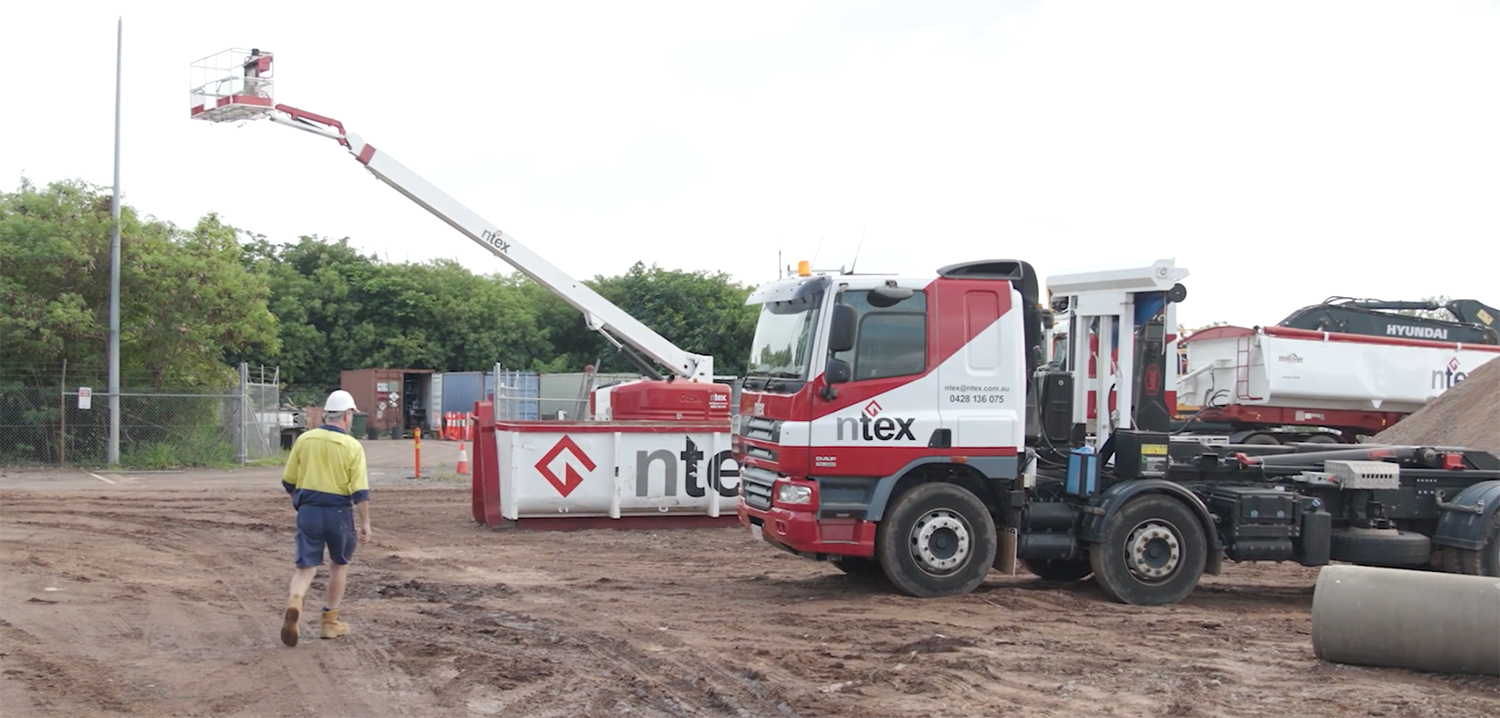
I engineered a rugged yet highly disciplined identity system designed to perform seamlessly from digital screens to high-visibility field environments.
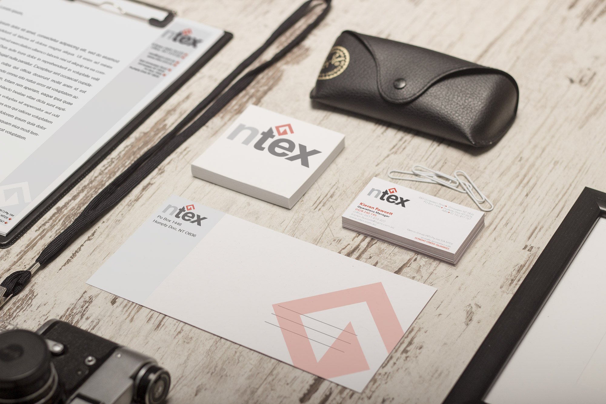
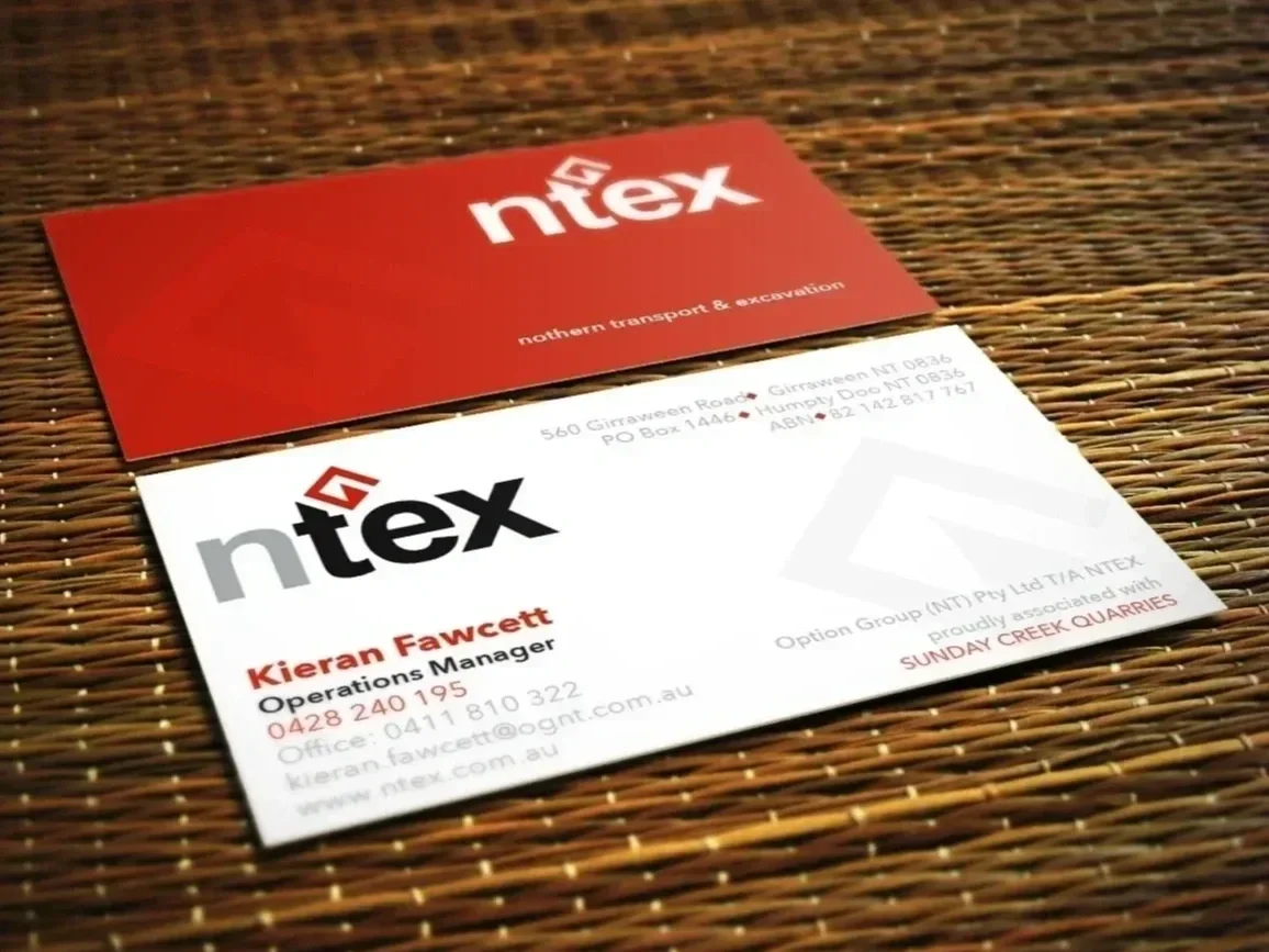
The Lettermark: Designed a bold, industrial lettermark subtly inspired by the mechanical form of an excavator, balancing heavy machinery aesthetics with corporate precision.
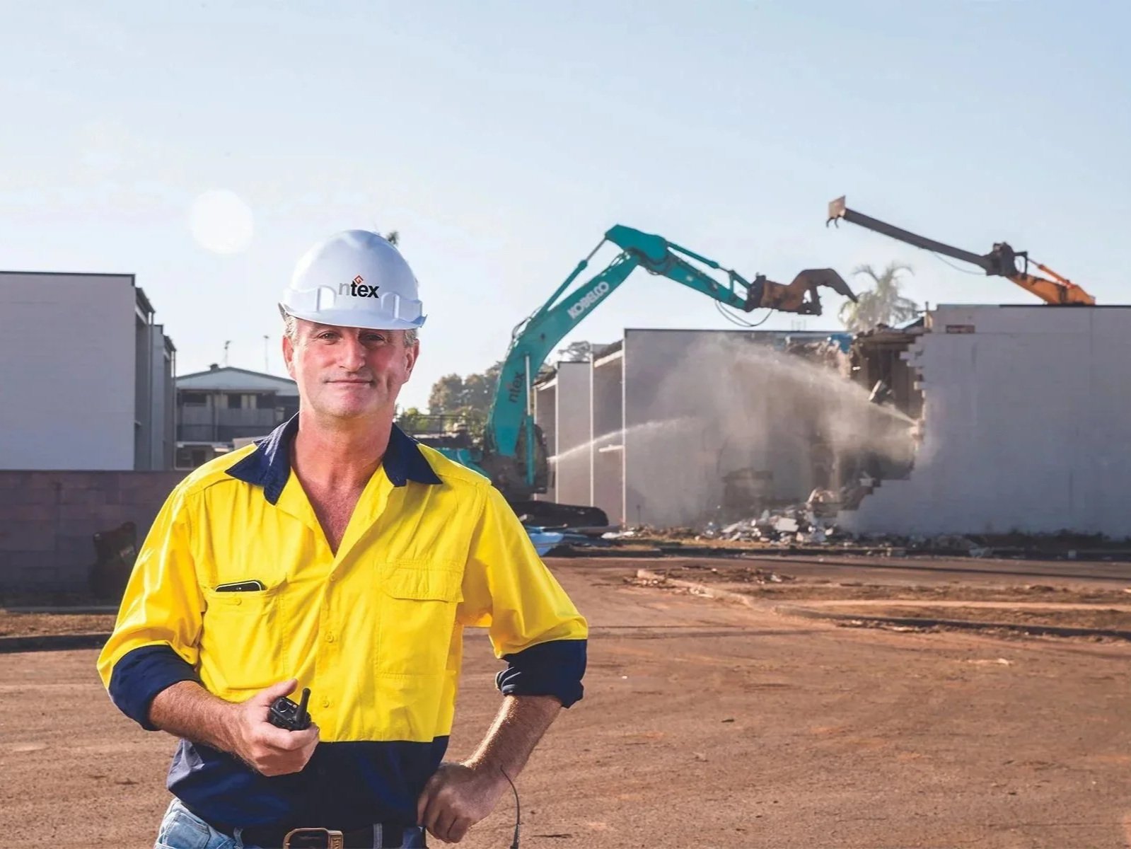
System Utility: Established rigid brand guidelines for high-contrast color palettes, safety-compliant layout structures, and raw, documentary-style site photography.
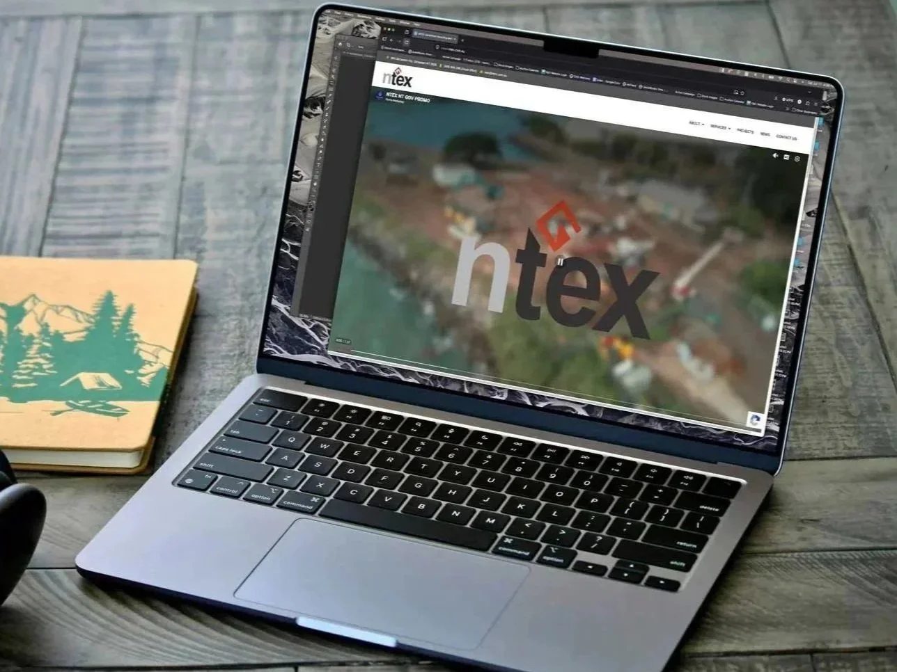
Brand Management: Scaled the system across diverse physical and digital assets, ensuring total brand alignment on heavy machinery fleet decals, high-vis personal protective equipment (PPE), digital platforms, and corporate tenders.
The Results
The professionalized brand architecture gave the company the institutional gravity required to step onto the national stage.
Major Win: Empowered the executive team to confidently pitch and secure extensive government infrastructure contracts.
Flagship Project: Anchored the visual presence for the high-profile Darwin Port overhaul.
Operational Unity: Unified a disjointed regional presence into a single, cohesive brand asset that increased market equity and crew pride.